Monday, September 16, 2013
Thursday, June 11, 2009
Fin.
And so the end has arrived.
The curtain is drawing a close on what has been a very, very interesting and educational unit.
So the whole point of this final post is to reflect on my blog, which I feel isn’t really going to take up many words, at all, and I usually always have something to say!
Well firstly I will admit that I am not the greatest blogger ever, in fact I think that I lack the blogging humour, sure I’m witty in person, but I don’t think that it comes across well in a blog. To be honest my blog sucked at first, but as I learnt more about how a blog works and learnt all about networked media, my skills developed. Due to my shit start of my blog, I didn’t attract any people to begin with, and it’s a known fact that one has to attract people straight away to receive any attention, this is not only in reference with blogs, but a reference to life in general. My lack of grabbing anyone’s attention meant that I ended up with a grand total of two followers, AND, wait for it…..
ONE COMMENT!
Sure it is not a popularity contest, but it sure is hard to write about anything, when nothing has happened. But I will admit that I am fairly good at reflecting, so I know that my posts themselves are of good quality. Maybe everyone is jealous of this quality? Doubtful.
It did take me a while, but I think I have learnt the number one rule of blogging. GET OUT THERE! Make yourself seen, comment other people’s blogs, follow people; all in hope that they will return the favour. It appears that I did not learn this until about ten minuets ago; when it hit my like a ton of bricks, or perhaps it was a light bulb that finally switched on. But I do think that my blog could only really be interesting for fellow people in this unit, as well as the odd networked media fanatic, but I doubt that these people actually exist, or would bother with my little blog. I do believe that I have improved in my blogging skills, and that definitely shows with my more recent blogs, where I was able to find more information, and attach more to the blog, this of course was only possible when I had something good to talk about. And so this brings me to my three posts that I am supposed to nominate. These blogs are from three consecutive weeks, coincidence? I think not.
Three blog posts:
Week Ten – Web 2.0
Week Eleven – Multiplicity
Week Twelve – Data Visualisations
How was Blogger itself, you ask? Well I think that it was really easy to use, and perhaps if I had the confidence to experiment more with HTML, I could of created a cool looking blog, but I lack said confidence, but it was nice to know that this freedom was there. I only really had one hiccough with blogger, and I in fact blogged about it, appropriately titled ‘Blogger Sucks’
Overall I learnt a lot in this unit, and I don’t think that I will ever forget, due to the fact that this blog is so easily accessible. I can access it anytime if I so wish, to maybe remise about what was possibly my favourite class for semester one (I am still undecided). I especially enjoyed working on my geo-narrative as it was something that I had never done before, and when I showed others, they seemed really impressed that the story was located on Google Maps, of course I would have to admit that that was merely just apart of the assignment, but they seemed impressed either way. Actually all three assignments were something that I had never really explored before, which is great, as I came to Uni to learn new things, and this course definitely allowed this to happen.
Thank you for the journey into networked media!
Thursday, June 4, 2009
Assignment Two Rational
For assignment two of Networked Media Production, I did a geo-narrative. This assignment was a very interesting look at networked media. I had a lot of fun writing my geo-narrative story, and although it may be perhaps a little too long, I do think that it is an enjoyable read. I hope? My original idea was to write a government conspiracy, which envolved into a ‘not too distant future’, where Swine Flu has mutated into a plague like virus, affecting many Australians. The main character is an ASIS (Australian Secret Intelligence Agency) agent, which is according to Wikipedia an agency similar to the USA’s CIA and UK’s MI6. All I did to find out this information was to simple google, ‘Australian Secret Service,’ and the first thing that popped up was the official site for ASIS. I tried to for all my information, research and gather correct information, like the train times in Sydney, and Jet Star flight plans from Sydney to Gold Coast.
Finding photos to work along my text was more of a challenge. I wanted my character to go to places where I had pictures of, so he travelled to my last year’s holiday destination in the Gold Coast. I only ended up using eleven photos, six from creative commons, four of my own, and one that I remixed. I used photos when I thought that it was a pivotal chapter, and one that also did not have long text. The chapters that did have long texts rarely had a photo attached to it, as I felt that the photo and the length of the text would only scare off readers. I contacted the people which I had used their in my assignment, and left my email. I am hoping for some responses, but I suppose the most important response I am looking forward to is from UC, containing my mark. Overall I think that Creative Commons is an awesome way to legally share photos, without which networked production may not be as rich as it is. I hope you enjoy/enjoyed reading my assignment, as much as I loved working on it.
Check out my assignment:
View One Flu Over Berkley’s Head in a larger map
Friday, May 29, 2009
Week Fourteen
This week was much the same as last, there was naturally no lecture, and all I had was the tutorial. The tutorial had a grand number of three people in it, possibly four? It was hard to tell, as there were other students in there, doing class work from their own courses. It was yet again a tutorial where we were able to work on our assignments. Over the weekend I did finally think of an idea for my geo-narrative. It all stated with a wanting to write about a government conspiracy. With a helpful idea from my mother, I started developing possible plot lies centred on the Swine flu. I decided to set it in a not to distant alternative future, where the swine flu has in fact mutated, and has spread across the whole of Australia. With this idea, I just stared piecing together a beginning, and I went from there. At this moment in time, I am about half way though the story and I have no idea how I am going to conclude it. But this is how I write my creative work, I let things pan out naturally, I don’t really like planning stories, I like to take a journey, and see were my words and characters take me. Along the way I naturally do a lot of research, and already I have looked at train times in Sydney, as well as Jet Star flight times from Sydney to Gold Coast. Gold Coast you ask? Well I decided to set my story at places where I have actually been. Firstly so I have knowledge of the appearance, and secondly I have photos of these places. Fingers crossed that it works.
Friday, May 22, 2009
Week Thirteen
There was no lecture this week, in fact there will be no more lectures at all for the semester. In the tutorial we worked on our assignment, and as I may have previously mentioned, I am planning on doing a geo-narrative for my assignment. This planning stage has turned into a definite yes, and now I will have to work out exactly how I want to present this information. Thankfully, Nathan showed us how to use Google maps, and it seemed incredibly easy. Google maps is such a great building block for many networked media production ideas, and this idea in particular promises to be very fun. For the remainder of the tutorial, I messed around with Google maps, unsure exactly on what I wanted to write in my geo-narrative. I think that it will most likely end up being a fiction story, and I guess I have to play the waiting game, until an idea pops into my head.
Wednesday, May 13, 2009
Data Visualisations
The lecture this week was all about Data, and more specifically data visualisations. Data visualisations is basically an abstract way in representing data, key points in creating this abstract effect include; scale, colour, shape, position, movement. With the new age of the Internet, data visualisations have grown in the capabilities in how they can function. With such things as API’s, people can create data visualisations that collect data from numerous sites; they can then process this data, and create an interesting way to look at the information. A great example of this is the website known as ‘We Feel Fine.’

‘We Feel Fine’ collects people's thoughts from twits, blogs and the like. This information is then collaborated in a very interesting way. There are six different views, all very different to each other. Each individual thought however has a certain colour, depending on what emotion the thought is conveying. The first and most identifiable view is the ‘madness’ view, which to me looks like a bunch of small balls, atoms perhaps, moving around the page, all on an individual path.

All you have to do in this view is click onto on of the moving balls, and the attached thought appears at the top of the page. The thought is linked to the original source, so if you wanted to see the person behind the thought, it is just one click away.

Round balls are just thoughts, while the less common square shapes are a photo with a relating thought.

The other views, all though very different, function in a similar way. The view is only a tool to present the important data, that of human emotions and thoughts. The data can be broken down, into ages, and sex, to see what emotion a certain age group or sex, is feeling around the world. This data visualisation is very cool, and I recommend you check it out.
An example of another data visualisation that I personally found really interesting is the site known as Word Count. It ranks 86, 800 words most commonly used in the English language. The words are set out on a timeline from most common to least commonly used. The more common the word is, the bigger it appears in size. There is also a search bar, enabling you to search certain words to check out what number they are ranked. Not surprising, the most commonly used word is ‘the.’ Interestingly enough the first verb to appear is ‘have,’ which was ranked number 21. It was fun to type in my name, and then my friends names to see where I ranked compared to them. Then the question rises whether one would want a common name, or an uncommon name. I wonder what would be the first name to appear on the timeline, Jesus perhaps?
Even just sitting here I am thinking of words that I would want to search…
Supercali Fredigliosudocis.
Disney.
Sex.
Tequila.
Tissue.
Mouse.
Chair.
Book.
Keyboard.
Lamp.
Yes I am now just naming things within eye distance…
Overall I think that data visualisations is an awesome way to present data, it allows the user to interact, to have fun, to explore, and to learn!

‘We Feel Fine’ collects people's thoughts from twits, blogs and the like. This information is then collaborated in a very interesting way. There are six different views, all very different to each other. Each individual thought however has a certain colour, depending on what emotion the thought is conveying. The first and most identifiable view is the ‘madness’ view, which to me looks like a bunch of small balls, atoms perhaps, moving around the page, all on an individual path.
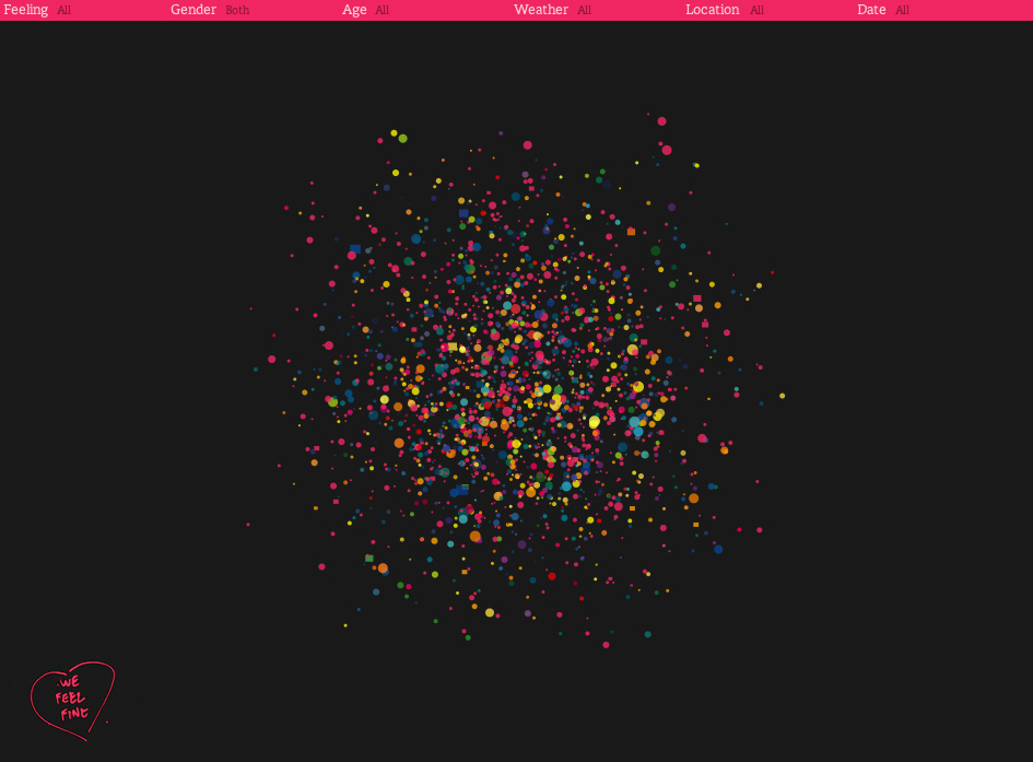
All you have to do in this view is click onto on of the moving balls, and the attached thought appears at the top of the page. The thought is linked to the original source, so if you wanted to see the person behind the thought, it is just one click away.

Round balls are just thoughts, while the less common square shapes are a photo with a relating thought.
The other views, all though very different, function in a similar way. The view is only a tool to present the important data, that of human emotions and thoughts. The data can be broken down, into ages, and sex, to see what emotion a certain age group or sex, is feeling around the world. This data visualisation is very cool, and I recommend you check it out.
An example of another data visualisation that I personally found really interesting is the site known as Word Count. It ranks 86, 800 words most commonly used in the English language. The words are set out on a timeline from most common to least commonly used. The more common the word is, the bigger it appears in size. There is also a search bar, enabling you to search certain words to check out what number they are ranked. Not surprising, the most commonly used word is ‘the.’ Interestingly enough the first verb to appear is ‘have,’ which was ranked number 21. It was fun to type in my name, and then my friends names to see where I ranked compared to them. Then the question rises whether one would want a common name, or an uncommon name. I wonder what would be the first name to appear on the timeline, Jesus perhaps?
Even just sitting here I am thinking of words that I would want to search…
Supercali Fredigliosudocis.
Disney.
Sex.
Tequila.
Tissue.
Mouse.
Chair.
Book.
Keyboard.
Lamp.
Yes I am now just naming things within eye distance…
Overall I think that data visualisations is an awesome way to present data, it allows the user to interact, to have fun, to explore, and to learn!
Sunday, May 10, 2009
Week Eleven
This week we had a really interesting lecture on multiplicity. The lecture was a basic introduction into this concept, that for personally was an eye opener to the things that we can be achieved with computers and the networked media. Multiplicity is the idea of “many-ness” with the collaboration of similar things that unite together. An environmental example is that of a flock of birds, where every single bird is their own individual being, but when they fly together, they unite and form intricate puzzle like shapes, allowing them to fly in harmony. A media example is of the 1K Project, where a man played a car racing game 1000 times on the same track, and collaborated all these games into the one video, with an amazing result. I don’t know whether to admire the video or the sheer fact that he had to play 1000 games.
Another amazing media example is the photo works of Peter Funch and his NYC street scenes. Peter Funch spent weeks taking photos on Manhattan street corners, to then edit similar themes together to create single photographs, with a result that is bound to amaze you.
I especially like this photo, a NYC street filled with children, something that could never possibly happen in reality. The photo really embodies innocence and youth, and makes me wish that I was still young, without a care in the world.

I also quite like this image, a close up of people with varying degrees of emotion. I think that I am drawn to this photo as it depicts raw emotion. All these people edited together in the one street scene creates an overwhelming amount of emotion.

I feel multiplicity is best understood with examples, and I think that these examples are relevant, and incredibly interesting through their explorations of unique concepts.
In the tutorial we discussed multiplicity some more, and Nathan showed us the above examples, which helped me get a better grasp on what multiplicity actually is. Nathan also went around discussing assignments with everyone, and after telling him of my desire to do assignment 2, the geo-narrative, he said that next week we would learn the technicalities of using google maps, which will help as this a component of what is required in the assignment. I finished off the lesson with reading ‘21 Steps,’ which is a story that uses google maps as a platform to narrate the story. This helped give me ideas for my own assignment, mainly not to have a shit and anticlimactic ending as ‘21 Steps’ did, so not to make the reader feel that they wasted their life away on reading a shit ending. However, the way that '21 Steps' was created was really interesting, and the story flowed well with the changing locations, but I feel that the ending was terrible, and after spending a fair amount of time reading it, it would have been at least an hour, I feel like it was a waste of time, as the ending was THAT shit.
In the tutorial we discussed multiplicity some more, and Nathan showed us the above examples, which helped me get a better grasp on what multiplicity actually is. Nathan also went around discussing assignments with everyone, and after telling him of my desire to do assignment 2, the geo-narrative, he said that next week we would learn the technicalities of using google maps, which will help as this a component of what is required in the assignment. I finished off the lesson with reading ‘21 Steps,’ which is a story that uses google maps as a platform to narrate the story. This helped give me ideas for my own assignment, mainly not to have a shit and anticlimactic ending as ‘21 Steps’ did, so not to make the reader feel that they wasted their life away on reading a shit ending. However, the way that '21 Steps' was created was really interesting, and the story flowed well with the changing locations, but I feel that the ending was terrible, and after spending a fair amount of time reading it, it would have been at least an hour, I feel like it was a waste of time, as the ending was THAT shit.
Subscribe to:
Comments (Atom)