
‘We Feel Fine’ collects people's thoughts from twits, blogs and the like. This information is then collaborated in a very interesting way. There are six different views, all very different to each other. Each individual thought however has a certain colour, depending on what emotion the thought is conveying. The first and most identifiable view is the ‘madness’ view, which to me looks like a bunch of small balls, atoms perhaps, moving around the page, all on an individual path.
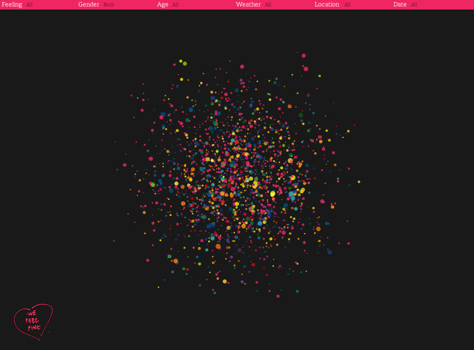
All you have to do in this view is click onto on of the moving balls, and the attached thought appears at the top of the page. The thought is linked to the original source, so if you wanted to see the person behind the thought, it is just one click away.

Round balls are just thoughts, while the less common square shapes are a photo with a relating thought.

The other views, all though very different, function in a similar way. The view is only a tool to present the important data, that of human emotions and thoughts. The data can be broken down, into ages, and sex, to see what emotion a certain age group or sex, is feeling around the world. This data visualisation is very cool, and I recommend you check it out.
An example of another data visualisation that I personally found really interesting is the site known as Word Count. It ranks 86, 800 words most commonly used in the English language. The words are set out on a timeline from most common to least commonly used. The more common the word is, the bigger it appears in size. There is also a search bar, enabling you to search certain words to check out what number they are ranked. Not surprising, the most commonly used word is ‘the.’ Interestingly enough the first verb to appear is ‘have,’ which was ranked number 21. It was fun to type in my name, and then my friends names to see where I ranked compared to them. Then the question rises whether one would want a common name, or an uncommon name. I wonder what would be the first name to appear on the timeline, Jesus perhaps?
Even just sitting here I am thinking of words that I would want to search…
Supercali Fredigliosudocis.
Disney.
Sex.
Tequila.
Tissue.
Mouse.
Chair.
Book.
Keyboard.
Lamp.
Yes I am now just naming things within eye distance…
Overall I think that data visualisations is an awesome way to present data, it allows the user to interact, to have fun, to explore, and to learn!


No comments:
Post a Comment